There are no easy answers when it comes to the matter of conversions in eCommerce. Conversion rate optimisation is a task that involves not only marketers but also developers and designers. CRO is a complex of measures: ameliorations in UX/UI, experiments with content, seeking ways to improve core web vitals of an online shop, adding social proof, and so forth. Let’s consider what could be done to see your CR rising.
What Is CRO?
The conversion rate is calculated the following way: the number of people who performed any desired action is divided by a total of visitors (basically, per month).
According to Statista, CR in eCommerce was 2,17% as of the end of 2020. The average percentage fluctuates from 1% to 3,41%, depending on the industry, country, and device.
Despite the fact that it’s tough to reach a two-digit number of CR, some retailers manage to do so. For instance, Amazon’s average conversion rate is in the range of 10 to 15%.
Different types of conversion should be in the limelight of an online seller, software provider, and so on:
- Order placement (purchase);
- Subscription to a newsletter;
- Submitting contact info;
- A download of a trial version / start of a trial period.
Certainly, for online shops, the first and the second points are the most relevant.
CRO is a toolkit aimed at making any of these actions easy, convenient, and desirable. Your online shop must be so user-friendly and its content so meaningful that it seems natural to a prospect to move through a sales funnel to the finish point: conversion.
Now we’ll make a to-do list that will help to conduct CRO right.
A CRO Plan
To better understand which aspects prevent leads from taking action and what must be fixed, you should opt for an almost scientific approach. We’d recommend the following sequencing:
- Analysis. Use various analytic tools to examine crucial KPIs of your online store. These metrics give valuable insights about users’ behaviour and prompt what might have disturbed them during their customer journey. Heatmaps are great helpers in this investigation too.
- Choosing tactics. After outlining pain points, you can move on to particular ideas. There can be solutions and amendments related to the loading speed, design, navigation, and content of the online shop.
- Testing. Experts advise checking out all controversial changes like the colour of buttons and layouts or CTA wording. A/B or multivariate testing adds some credible data about visitors’ perception of novelties. You’ll gain even more knowledge about your future clients.
- Changes and analysis. Gradually apply selected tactics while measuring the efficiency of your efforts.
Further, we’ll regard some proven ways to increase the CR of an online shop.
Four Actionable CRO Methods
1. Go Mobile-First
This year the proportion of m-commerce in the whole eCommerce sales is expected to reach 72,9%. In the meantime, the conversion rate on mobile is the worst across devices: 3,41% for tablets, 2,59% on desktop, and 1,86% on smartphones.
What does it mean? Arguably, loads of online shops have issues that drastically reduce CR. Even the most prominent of them fail to pass a Google PageSpeed Insights test. But people are used to shopping via smartphones; thus, you can sell far more if the mobile version of your website performs flawlessly.
There are at least three ways to become a mobile-friendly brand:
- Create a responsive website. It will adjust to every format/size and display content correctly across devices. But nothing more.
- Create a mobile app. It will take into account all peculiarities: how people handle smartphones, browse through pages, tap on buttons, etc. As a result, a native app will have superior UX/UI. Besides this, such apps work very fast and smoothly. The drawbacks are the expensiveness of development for iOS and Android separately and the need to download a weighty application.
- Build a PWA. It is a kind of compromise between the aforementioned variants. A progressive web app is a website that users perceive as a native app. It has a responsive design borrowed from mobile apps, impressive loading speed, and advanced features unavailable for regular sites (push notifications, offline mode). Moreover, customers can add a shortcut to a home screen, but a PWA won’t take up any considerable storage space. Amongst flaws are some limits imposed by iOS.
Below is the example of the Puma Mexico PWA that looks and feels like a native app.
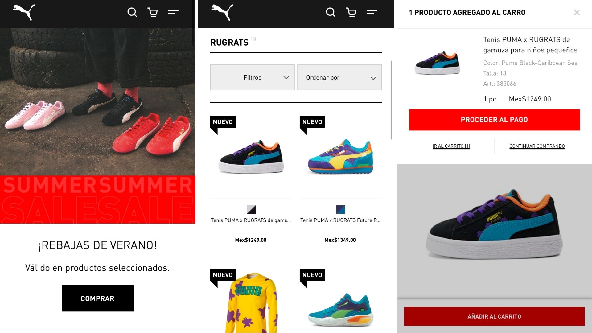
Screenshot taken on the official Puma website
2. Craft Powerful CTAs
Every call-to-action on your website is an anchor that grabs one’s attention and suggests to convert. There is a handful of factors that influence the visibility and the effect of your CTAs:
- Placement. It’s better to locate core buttons within sight. Basically, it’s not a problem on desktops, but many brands overlook this moment on mobile versions of online shops. Take a look at the screenshot from Fendi. Users have to scroll down to find the “Add to cart”, “Add to wish list”, and “Find in store” buttons. In the meantime, the main one can be pinned to the bottom of the product page (to always be seen above the fold).

Screenshot taken on the official Fendi website
- Size and colour. The button must be as vivid and large as possible. This is especially convenient for those who shop on smartphones. For instance, both mobile and desktop versions (see the screenshot below) of Fendi’s online shop abide by this rule.
- Wording. It ought to be concise and urging to act the way a merchant wants.
Screenshot taken on the official Fendi website
3. Social Proof Is Never Too Much
Most giant retailers have a review section on their websites. The primary reason behind it is that the opinions of customers are meaningful for prospects. Average shoppers do not have a goal to promote; therefore, others can count on absolute objectivity.
Pay attention to how handy your review section is in use. MAC (in the screenshot below) allocate a few blocks for easy navigation:
- The number of positive and negative reviews. Leads can instantly estimate how the rest find this item without even reading tons of text.
- Tags. With the help of this info, users can see which benefits stated in the product description were noted in actual use.
- The average rating. A person sees the overall evaluation and the number of reviews that points to the demand for the product.
- Filters. Visitors can choose a particular shade of product to read the most relevant information.
- Reviews. Finally, people can check out detailed feedback that will definitely affect their decision.
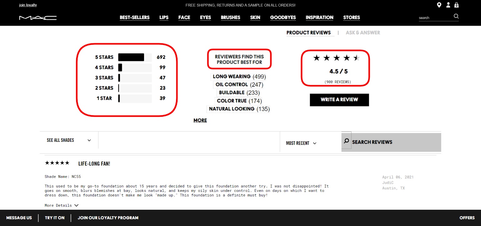
Screenshot taken on the official MAC website
4. Polish Your Product Pages
Indeed, the quality of your product and its price determine whether a consumer will be satisfied or not. But before the delivery, they can rely only on info they see on a product page. Let’s highlight points worth constant attention:
- Product description. Underline critical benefits of an item as well as advantages of owning it.
- Details. Sometimes it’s hard to find data on the simplest yet fundamental matters. What material is it made of? Is it an oversized item or a regular fit? Which size does the model wear? Try to address all these questions as they will surely occur in users’ minds. Have a look at the screenshot below from H&M to get the idea. Note that the brand located such details right in the product description.
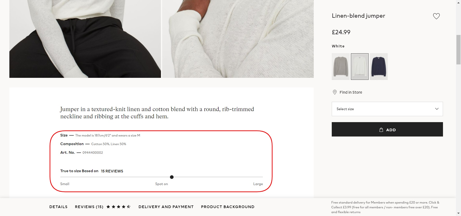
Screenshot taken on the official H&M website
- Photos and videos. Content of perfect quality is a sign of a trustworthy brand. The opportunity to see the product from all angles persuades to convert. We’d recommend adding macro photos of an item when the material it is made from is essential. Short videos can give even more comprehension about commodities than images.
To Conclude
There are many more working strategies and tactics of conversion rate optimisation. Don’t neglect the classic SEO and newfangled voice search optimisation, work on your brand’s values, and get a grip on your online shop’s performance across platforms. The complex approach to CRO, together with the qualitative product and customer service, conduces to higher conversions.
About the Author
Kate Parish

Kate Parish is the chief marketing officer at Onilab with over 8 years of experience in Digital Marketing in the sphere of eCommerce web development. Kate always aspires to broaden her competency in line with cutting-edge global trends. Her primary areas of professional interest include SEO, branding, PPC, SMM, Magento PWA development, and online retail in general.